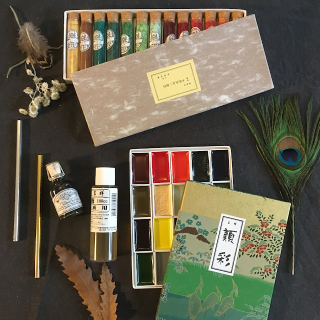
Charvin Watercolour Review


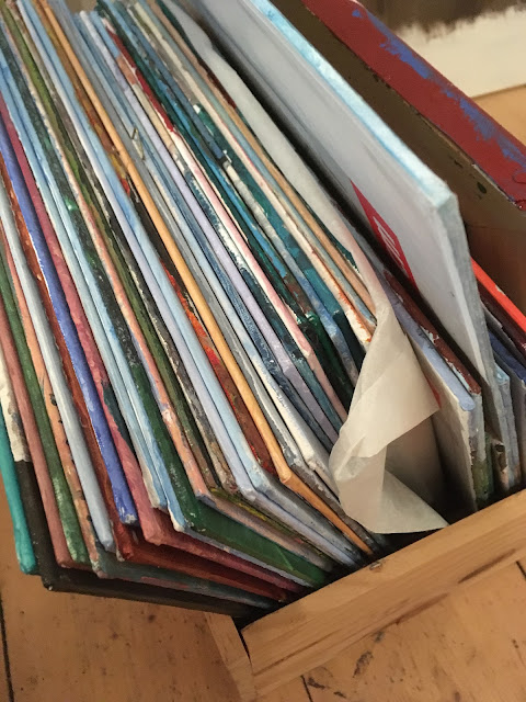
More than a year ago I spent a weekend in Paris and wrote a series of blog posts about my time there as well as the materials I brought back. Being the Autumn before the pandemic began, it feels much closer than it actually was. One of the items that I loved buying and owning but have hardly used is a small box of Charvin watercolour paints. The colours are really lovely and different from my other sets. They create an interesting palette yet they have remained virtually untouched this last year and a half.

When using any aquarelle/watercolour paint there are a few specific attributes that I find critical. They are Texture, Easy of Activation, Transparency, Pigment Load, Ability to mix/move around the paint, and Layering potential.
Let's take these one at a time:
1: Texture
There are several different textures available. One when wet, another when dry. When wet a paint can be either smooth (even creamy) or granulating. When dry it can be chalky or glossy.
This particular brand is on the smoother end. It is a bit sticky feeling which I have to admit isn't my favourite. The dried paint is glossy, however and has an almost shellac like appearance which can be interesting. I do like the glossy smoothness of the final illustration, although I wouldn't want it in every piece I do. It can be an interesting addition to what I can choose to do with the various watercolour techniques available to me. It appears that honey may be a component in the binder.
2: Ease of Activation
Activating the paint just means adding water to it until it is damp enough to paint with. Depending on the binder used and a few other aspects activating the paint can fall anywhere on the scale of very easy (I find my white nights and gansai paints fairly easy to activate in general) to middle (most Schminke colours, to rather difficult (Sennelier). This particular paint is most similar to Sennelier. It requires quite a bit of coaxing to be able to use and because it is rather sticky it goes back to being difficult quite quickly.
3: Transparency
How transparent a particular paint is determines how it can be used- Very transparent colours can be layered to create interesting depth whereas more opaque ones can be used to build up structure. This particular brand is quite transparent. In fact I had a hard time getting much depth of colour. I ended up using my larger watercolour box to create contrast.


4. Pigment Load:
This is how much pigment is actually mixed into the binder. How much is present will determine how dark the colour on your page is. In a comparison of the brown tones this set appears to have a lower pigment load than I am used to using. This could contribute to my difficulties in building up enough colour intensity in a reasonable amount of time.

5. Mixability/ Moving Paint Around:
In terms of how easily colours could be mixed the limiting factor seemed to be the stickiness of the paint. when fully activated the paint mixed well.
Where this paint really shines is in its ability to be moved around. As the pigment load is lower I was able to move the pigments into lines or shapes even through the layers. This allowed me to manipulate the illustration more that usual.

6. Layering potential:
This is perhaps the best attribute of all in this particular brand. Because of the shellac like finish of the individual layers, it can be layered on more quickly and easily than in most brands I have used with very little risk to the paper itself. If you look closely at the shell below you will see that the light blue highlights have been layered over the reddish brown marcations without causing them to feather (smear due to adding water) at all.

My overall impression of the paint was that it is slightly lower quality than it ought to be based on the overall quality of the shop that produced it and the quality of the gouache tubes bought on the same premises (they are exceptional). Its main drawback is that it is extremely difficult to build up enough colour to create actual contrast.
It does however have two interesting and unique characteristics, most similar to Sennelier, its shellac like finish and the ease with which pigments of multiple layers can be pushed around the page. These two characteristics are indeed worth further investigation.

While I don't think I will use these paints alone, primarily due to the difficulty in reaching my preferred colour intensity, they do offer an interesting compliment to my existing set up. If you are new to aquarelle I might recommend another brand, Schminke Hordam or White Nights for example, but if you already have quite a few different options and are looking for something a bit different they might be interesting. They are available in beautiful tones and I can imagine that they would work in harmony with Sennelier paints.

I hope this has been helpful. I would like to reiterate that I am delighted with the gouache in tubes by Charvin and think everyone would enjoy it.
If you liked this post you might also enjoy other material reviews:
- Choosing the right paintbrushes
Here are two posts sharing more about the shop:
Did you know that I am now on Skillshare? Check out my new Skillshare class on creating a 'time- Capsule Sketchbook'

To get posts as soon as they are published click on the subscribe button at the top of the page or Follow by clicking on the follow button.


Thank you so much for posting a review. I was so fascinated with these paints and there are almost no reviews of them, so I ordered a set from France to the USA just to satisfy my curiosity (super expensive to do so). When I got the paints, I tried them before your review and I have to say, like you said, I was disappointed because I thought a world renowned professional paint company like Charvin would only have top notch products. These watercolors just fall so short. I could only get good saturation out of the yellows and oranges, everything else (especially the dark blue) was so difficult to get a good saturation out of no matter how much layering or scrubbing you did. And the shininess drives me crazy. I am throughly disappointed in the watercolors especially given their price and brand name. ):
ReplyDeleteThanks for the great insights. Professional Trade show booth construction in Los Angeles ensures seamless installation and dismantling during busy trade shows. Trade Show Booth rental los angeles
ReplyDelete