Step by step landscape illustration in my sketchbook
Seven locations including two agriturismo, a city apartment, a cabin, a trullo and a bed and breakfast in an old port. That is what is on the agenda for our first Italian road trip. A longtime fan of all things Italian, I have been there more than 10 times over the last several years but we have always stayed in one location and made day trips. This year we make the grand tour and I have been working on this new fast illustration method in my sketchbook. It is not the style I will adopt in my work in general but I am hoping it will give me the ability to create a sketchbook full of colorful sketches of some of the places we visit. I have been testing methods as I shared in a post last week, but today I thought I would show you one of the sketches in steps so that any of you want to try it out you can.
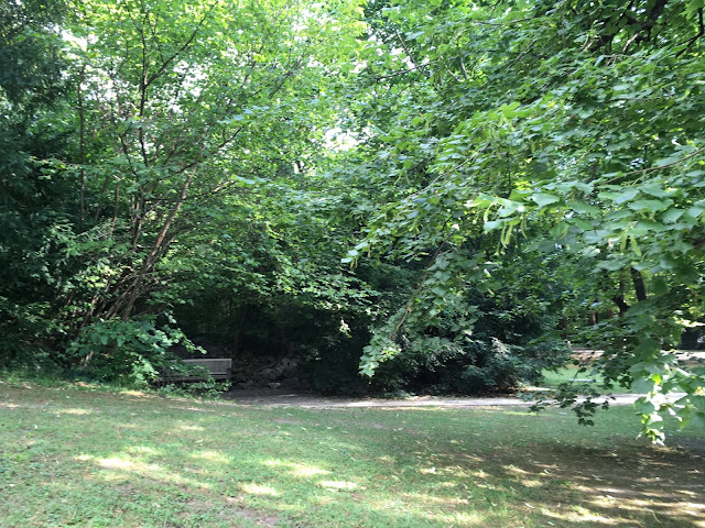
This is a little sketch based on a corner of the park where we picnicked yesterday afternoon.
I started out will with only colour this time, creating a nice mess. I hoped it would amount to something since I was really dissatisfied at this point.
Once it dried I started adding lines with a fine liner.I am pretty happy with the way the rocks developed. I am intentionally leaving out detailed crosshatching and shading. This is supposed to look like a picture book illustration rather than a realistic painting.
With the center drawn in the whole layout starts to take form.
I added detail to the foreground dealing lightly with the trees so as to keep the eye coming back to the focal point.
And here it is, developed as far as I plan to take it. I have added the heaviest lines at the center to draw the eyes in to the little alcove where the bench is.
If you are curious what it looked like in real life- here is a photo.
To get
posts as soon as they are published click on the subscribe button at the
top of the page or Follow by clicking on the follow button.


Comments
Post a Comment