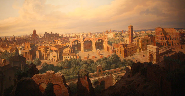
How to Create Depth in a Painting
One of the things that new artists often complain about is that their work looks too flat. Often the drawing is good and the colors are appealing but the overall piece leaves you feeling uninspired. Generally, this is a result of one of two issues, first improper use of perspective and second, unbalanced tonal value. Taking these two problems individually let's break down where most people go wrong. First of all, Perspective. It has not always been the case that art correctly portrayed depth. Leaving cave painting and Egyptian hieroglyphic imagery aside it is interesting to note that in the Middle Ages, many paintings were actually more two dimensional than three. Think of frescos and iconography where people are often painted in layers, like magazine cutouts glued in an overlapping design on a collage. These figures do not seem to have space between them. They also often sported very thin looking dogs or halos that looked like dinner plates. The folds of the robes also are painted in only one dimension leaving them more like pleats that round billowy folds.
One place that this type of two dimensionality is still common is in Bauernmalerei or folk art.
It wasn't until the early Renaissance that three-dimensionality was finally 'figured out'. the first thing that factors heavily into a feeling of three-dimensionality or space is the fact that the largest object is the one that is right in front of the eye. Objects become increasingly smaller the further away they get. Finally disappearing altogether at what is conveniently called the 'vanishing point'.
Along the same lines the details are crisper the closer to the eye they are, becoming more blurred the further away they get. This may sound obvious but think about a photograph for a moment. Often something that was visible to the naked eye while physically present at the place the photo was taken is indeterminate in the photo. This is the result of the focusing of the lens of the object in the foreground. Because the eye is elastic, especially, when it is young, we can shift that focus between near and far objects allowing us to see things relatively clearly that are still quite a way off. The resting position of the eye, however, focuses instinctively on the near at hand. A habit which keeps us from running into things or being caught off guard or injured. And as many have experienced personally, the eye grows less elastic as we age resulting in those increased difficulties in focussing on far-off objects. Knowing that this is how any type of lens works the same idea can be applied to a painting. The objects in the foreground can be painted largest and careful with comprehensive detail while dwindling increasingly as they fade (literally) into the background.
In the nineteenth century, there was a movement to create exceptionally detailed work in which the objects themselves had the correct tonal values, rendering them perfectly 3-dimensional while at the same time endowing every shape with the same level of carefully painted detail regardless of its position in the painting. This type of painting is known as Pre-Raphealite. It is exquisite in its intricacy but it looks somehow fake when one takes a step back.
The second aspect, tonal value, relates to the brightness of the highlights and the deepness, or darkness of the shadows. To the untrained eye, an object often assumes the color associated with that it, eg. the orchid is white, or the pitcher is blue. In reality, every object contains a spectrum of color from an almost black shadow to a virtually white tone in the areas where the light has hit it.
To see this for yourself take any object set it somewhere where there is a direct light source on one side, for example on a windowsill, and try to identify the different colors you see.
The key is to look at the object section by section rather than as a whole. An easy tip is to take a yellow post it note and use that to cover the area you arent looking at. You will find that your white orchid is suddenly comprised of yellows and pinks and a dark blueish grey shadow, or that the blue pitcher has a black or dark purple side and an almost white one. Getting this spectrum of color into the objects of a painting is what makes it both three dimensional and realistic.
Hyperrealism uses high detail to make something look like a close-up photo, sharp and in focus all over, whereas realism imitates what the eye actually sees, sharper here, fuzzier there, and comprised of a whole rainbow of colors. So next time you are looking at a piece of art- or creating one, ask yourself first, what colors are being used, are the darks dark enough? Most painters get their light colors light enough but leave their shadows too light. And second, do objects get fuzzier and smaller the further away they are.
Have you observed these tendancies in your own art or artwork you have seen recently- Leave a comment and share your experiences.
To get posts as soon as they are published click on the subscribe button at the top of the page or Follow by clicking on the follow button.


This comment has been removed by a blog administrator.
ReplyDelete