Watercolor Animal portrait Tutorial at Oma's Teekanne

Yesterday was my second 'long night of DIY' at our local tea shop, Oma's Teekanne (Grandma's Teapot). I decided to choose a theme which was a bit harder than last time and more in line with what I actually produce in my studio. I think I may have made it almost a bit too difficult for the time allotted, even though that wasn't the intention.
 |
| Portia ready to go |
I chose to do an animal portrait tutorial where I helped people to move through 4 basic steps from a simple outline to a finished piece in a realistic style. I had originally thought people might like to do baby animals since it is spring but they seemed, in overall, more impressed with wild animals, so we had some fun grizzly bears, tigers, etc...


General speaking the important things to keep in mind in such a picture are:
1- Work from light to dark. It is easy to darken an image but a lot harder to make it appear lighter if it is already too dark.
2- Work wet to dry. The first layers are the wettest and they become gradually drier throughout the process until the final details are done in a dry brush technique using so little water that the effect resembles watercolor pencils. (Wet just means that the brush is wetter and there is more water mixed with the paint).
3- Chaos to order. Think of entropy in reverse. the underlying layers don't have to be neat but the surface detail is what leaves the final impression. It needs to be orderly and neatly done.

We created animal portraits in four steps:
A pencil sketch:
This was a basic and very quick indication of form. It was really hard to keep people from spending too much time at this point. Many created really detailed sketches only to see them disappear under the first washes of color.

Wash in the lightest color to start building up three-dimentionality:
Here again, being exact wasn't the goal. The lightest color was used to create a crisp edge and a more rounded form. The important thing to note is that the color should create a clear line where it is laid down along the outer pencil line but can be as random as it wants on the inside of the form. The color was placed where there would likely be a shadow in the finished piece.
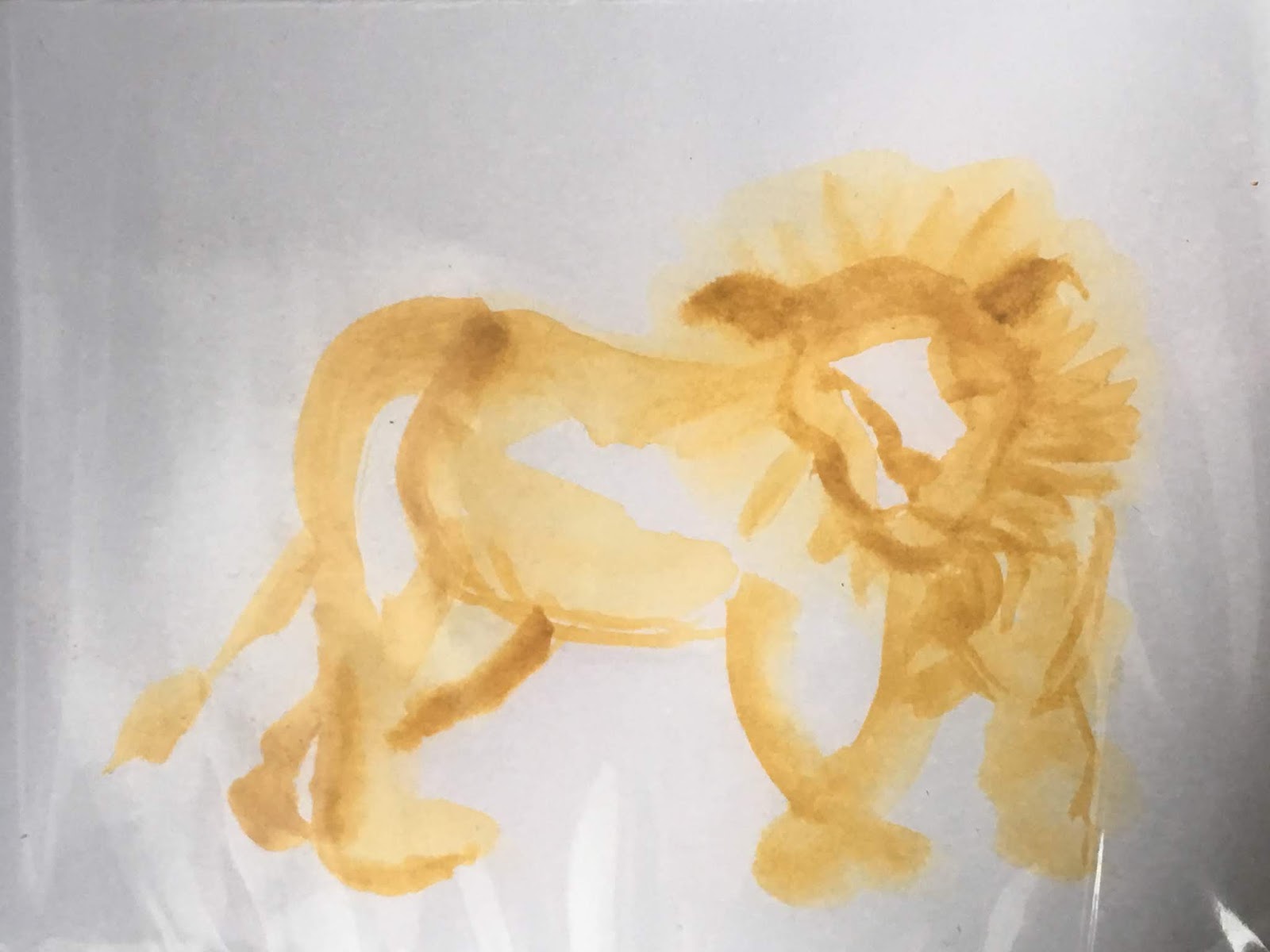
Midtone to create contrast:
Here a mid tone color was added to indicate areas that receded from the front of the image, hollows caused by underlying bone structure, etc... Again this step didn't have to be exact but was slightly less random from the one before it.

Surface detail:
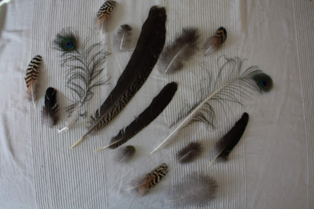
This was the point in the painting that was the most time intensive and the most carefully painted. Using the darkest color (other than black), fur or feathers were painted in with an almost dry brush in little strokes which followed the direction that they grow on the animal (or bird) in question. Occasionally a bit of black at the end creates more depth.

The results were really nice. People spent a lot of time and effort on their pictures and really were able to produce something lovely. I do think that since I had underestimated the time it would take them this would lend itself better to a full length workshop in the future. I can imagine that doing it with a group who starts at the same time could be quite fun. I guess you learn as you go, at least I do.


Have you painted animals? Do you use a similar technique? Let me know in the comments.
To get posts as soon as they are published click on the subscribe button at the top of the page or Follow by clicking on the follow button.


Comments
Post a Comment