How to take and use reference photos

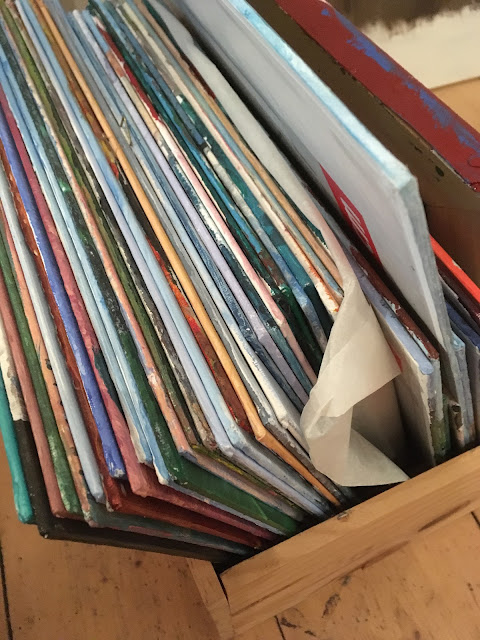
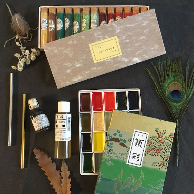
Windswept hills, waves crashing against the rocks, shooting a spray of white foam into the air at the foot of the cliff. Clouds, huge and fluffy, bigger than ships, hang lazily midway between heaven and earth. The patches of long grass, bending under the weight of their heavy heads sway almost imperceptibly under the haze of the late Summer heat. And I, paint tubes jumbled in an old laptop bag at my feet, begin adding in the deep purples and blues of the shadows on the canvas propped up before me. Two more hours of 'good light' until I break to eat the picnic I brought. At least that is how it would be if I were a painter in an Agatha Christie novel, or living in an artist commune for a summer residency. Real life is different- Ten minutes sketching in the little book in my handbag while waiting for the bus, a trip to said hills while children clamber to be fed and my husband waits to get back on the road. A few hours of quiet in the mornings to work in the studio, undisturbed, before the demands of a busy life resurface. Transferring the impressions gathered on my way through life onto the stack of canvasses forming a backdrop for the cats favorite sleeping spot takes strategy and pre-planning. And in this planning my camera is my best friend.

I often mention in a blog post that I 'took a lot of reference photos' on a recent outing. What does that mean and is it really different from just randomly snapping pictures of everything in sight? I don't think my husband would say so when he sees 250 pictures takes on our picnic:) But it is a little more intentional than that. These pictures convey not only the subject of a future painting but offer clues as to mood, weather, detail, time and composition.
This morning I went out with the intention of taking a few sample reference photos in order to better describe my thought process when behind the lens. I have collected two sets of images with two different types of subject for comparison.
Composition:
This is one of the easiest categories. I like to take several pictures of something that might make a nice painting. I usually try to take at least one centered, one off center, a landscape format, a portrait format, and one with something in the forground. Lighting and focus are less important here. What I look for is a general overall layout. In these pictures I dont mind if there are cars blocking the front of a building or other small items. These are big picture ideas. I usually add one more detailed picture to this collection just so I don't loose it.


 |
| This is the more detailed add on |
Lighting:
When possible it is nice to take an almost identical photograph in different types of light. I can often manage this if we either walk around a town, in which case passing the same landmark more than once is frequent, going on a long walk, in which you end up more or less where you started out, or while sitting at a cafe or visiting a specific location. Here are a couple of examples of the 'same' image under differing conditions.
 |
| Evening |
 |
| Morning |
 |
| overcast |
 |
| sun after a storm- see the roof |
 |
| overcast |
 |
| sun after a storm |
Overall Information:
Although I may only be interested in a specific part of a building/ machine, animal, etc... I sometimes try to take pictures of the subject starting in its entirety and moving toward individual details. Depending on what these will be used for the composition might not be important at all. They just serve as a catalogue of visual information.


 |
| Can you see the sword in the stone? |
These tend not to be very exciting as photos but generally prove quite valuable.
Perspective/ Detail:
And now to the detail shots. I have started playing around with the elements of my tea breaks in order to play with compositional elements like color and balance. How you see something often determines whether it will make an interesting or boring picture. What you leave determines whether it is simple or complex, and the perspective you see it from determines whether it appears random, organized, moderate or crowded.
From above:
 |
| Neatly aligned, the fish plate is 'readable'- orderly |
 |
| Long elements along the bottom- handle of teapot visible- fish is wrong- visually distracting |
Frontal view:
 | |
| From an angle- picks up detail of silver |
 |
| straight ahead- looks chaotic |
With background information:
 |
| feel like you are outside but image is overfilled |
 |
| Cant see tea in cup, no order discernible- busy. |
Well, no that you have an idea how I take and categorize reference photos I would love to know if you do something similar.
If you liked this you might also like:
- Personal project Black and white photos
- How I organize my drawing and sketching supplies
- My field kit sketching must haves
- Creating a routine to get things done in the Studio
To get posts as soon as they are published click on the subscribe button at the top of the page or Follow by clicking on the follow button.


Comments
Post a Comment