Salt technique in watercolor

I will be on my way to Italy early Saturday morning, my cat comfortably relaxing in the company of our housesitter, the studio empty for two weeks while I explore 'new to me' corners of Italy. I know I will be collecting reference photos and sketches by the ton and will be sharing my discoveries and creations on facebook and Instagram as well as here on the blog. This weekends post may, however be a bit delayed as I will have just left, so I decided to share my salt technique experiments that I have mentioned in the meantime.

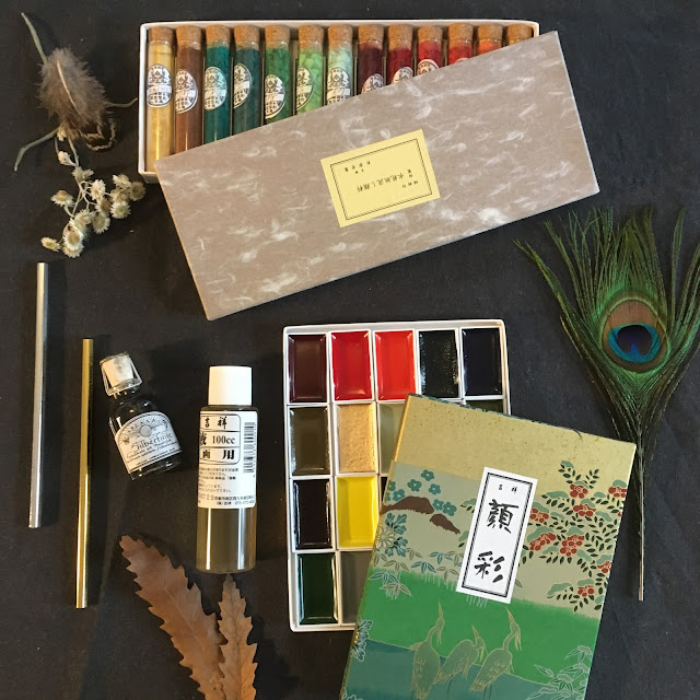
I tries two groups of colours: Normal and metallic. All of the metallics where a part of the gold palette I tested recently.

Group one:


Here is a close up of one of the turquise colors which I love using for water.

Group two:
 |
| gold pigments suspended in water |


I left them to dry completely.

I was not impressed with the metallic colours as the effects of the salt were barely noticable. The normal pigments reacted better although only one reacted really well and that was the prussian blue. The burnt sienna was the second best.

Here are close-ups of those two.
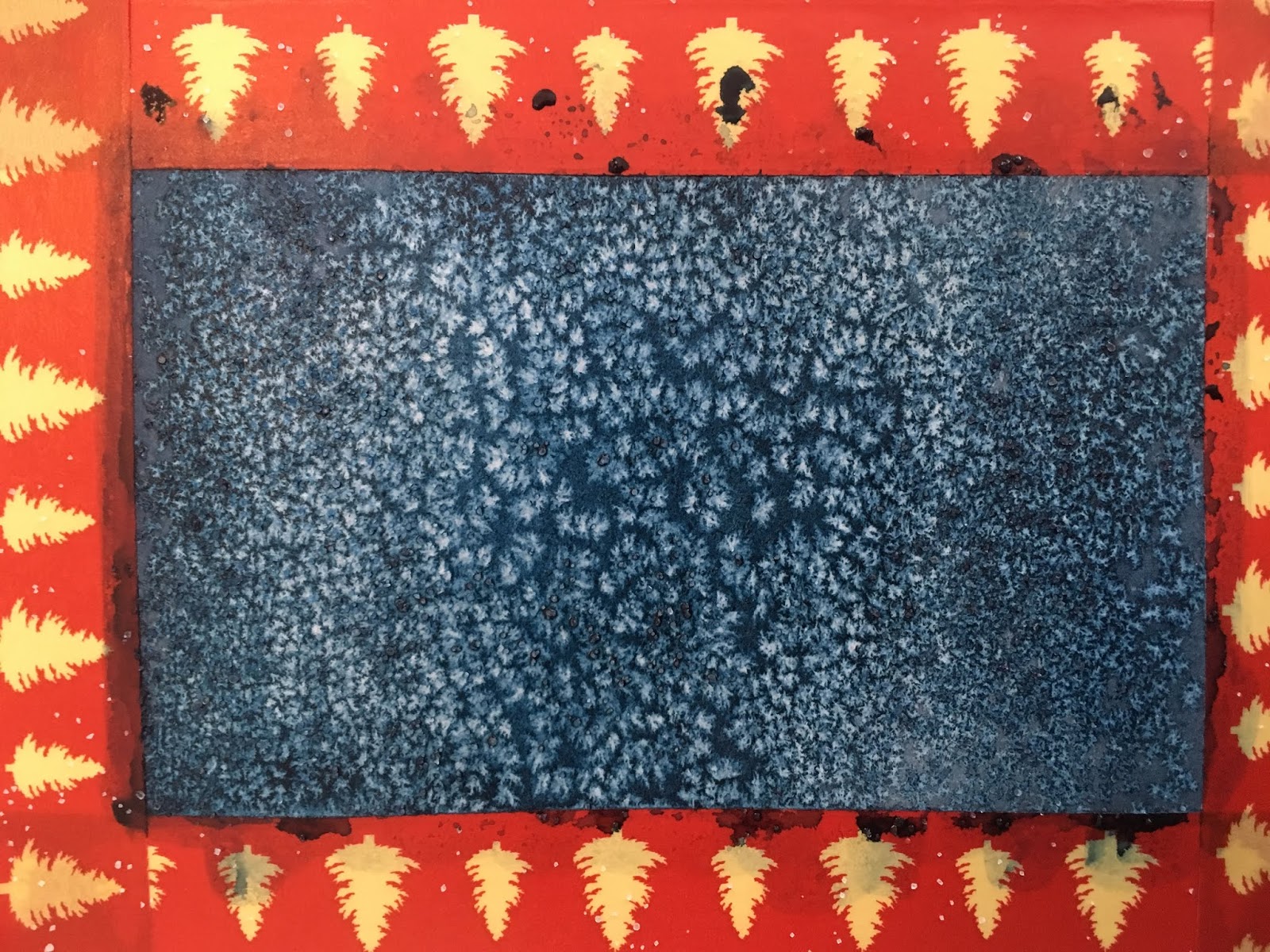

As you have seen in a previous post I used these test squares as a basis for botanical sketches.

Have you used salt with watercolour and if so how did you like the results? As you can see, I am still on a quest for the perfect tape, if you use one you love please do share! Thanks. Christmas washi tape is ok but not the greatest.
If you liked this post you might also enjoy other technique and personal project posts:
- Lion stamp step by step
- Black and white photo selection
To get posts as soon as they are published click on the subscribe button at the top of the page or Follow by clicking on the follow button.


Comments
Post a Comment