1 of 20 in 2020- an ancient tree

I finished the first of my 20 in 2020 challenge, a private initiative on my part to do better, discover how much I have learned, experiment with new techniques, and stretch my creative muscles. With the majority of these illustrations I will be operating under the hypothesis that since they have sat in my drawers for quite a while there really is nothing to lose. I say the majority because I have included a few pieces that are more recent and are coming along fine but just need to be completed.
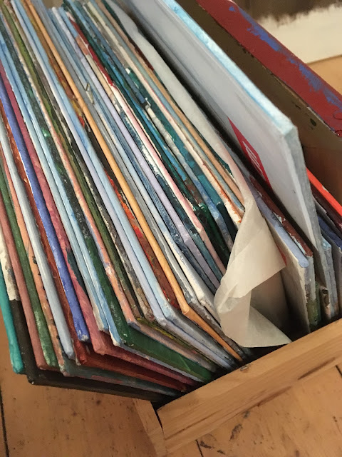
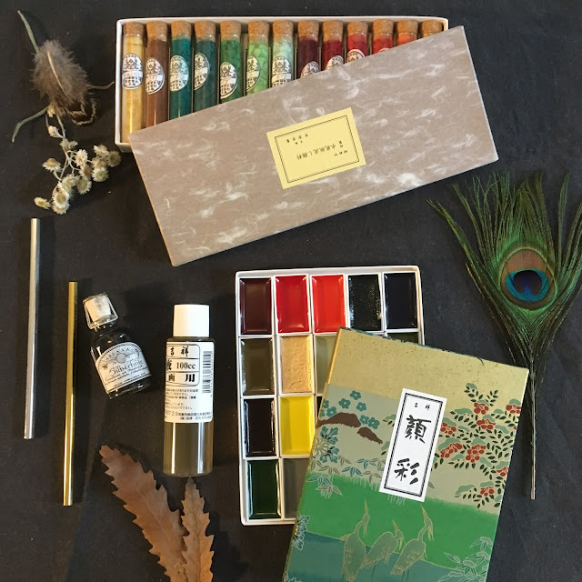
As I gathered them up after collecting and photographing them the other day. I grouped them into rough categories- I found, for example about 4 or 5 lovely watercolour backgrounds that I had made for fun just to experiment with moving colour around. I chose the green one of these for my first project. It is a mixture of a few schminke watercolors in my palate and the iridescent paint I picked up in the US. I will leave affiliate links below.
The shape of the paint suggested amoung other things, a tree. and as the trunk of the tree would necessarily be very wide and the crown rather short and compact, I decided on an olive inspired, fantasy species.

In southern Italy this summer we saw trees that had been standing for more than two millennia, having been planted there by the Romans, interspersed with rows of younger specimen lining the fields in a corduroy pattern. These beautiful trees become incredibly gnarled with age and weather. The trucks become disproportionately robust while the branches become less and less significant in proportion to the rest of the plant. I love their wild beauty and the fact that after so many centuries they still stand, bearing fruit and attesting to the longevity and continuing renewal of nature. Renewal seems a good theme for the beginning of a new year; continued growth, cyclical regeneration. Welcome, year of the olive tree- ;)
I began this illustration by using a new fineliner to draw the tree itself, allowing the branches to twist and turn as they would, without predrawing or plan. I was happy with it at this point but having left it on the board on the wall to be absorbed into my subconcious as I went about my daily business throughout the day, I felt that the fineliner was a shade too fine and that although something was obviously there, it was not quite definite enough to determine what it was without closer attention. This would be a good place to point out that the piece is done on A4 paper and is therefore a smaller work.

I decided to try a technique popular with urban sketchers when doing line work on toned paper, adding white to some of the line work to create the effect of light. This is where the experimental phase of the piece came in. Although I have watched a number of YouTube videos on the best white pens or pencils to use, I still haven't discovered one I really like. So I took the few white supplies in my cabinet and began trying them.

I was completely dissatisfied with the pencils and gel pen and ended up using an opaque white watercolour pigment bought in the US last year.

I did have to thin it with water to be able to use it with my small pen. This is a pen I bought in Paris and therefore counts as part of the challenge to actually try out and find the best ways to utilize the supplies I have purchased most recently.

This ended up working fairly well. The colour did dry and cake the nib making frequent rinsing a necessity.


I painstakingly added white for the better part of morning and, after leaving it overnight, decided that I had done as much as I wanted on this particular piece. I wanted after all to create light, not a white tree. I think I have achieved that on the level that I had intended. A lot of tea was consumed in the making of this tree.

If you would like to buy a print of this illustration it is available on Oh My Prints- The link goes to the German site, the language can be changed in the upper right hand corner.

Supplies used in this piece:
Schminke Aquarelle
Pro White
Fineliners (not an affiliate link)
the iridescent paint


Dear Sahra,
ReplyDeleteI really appreciate your artwork and your pictuers/paintings. It is very inspiring , aspecially with all the pictures in the blog. It`s very cool, how you describe the process of making those pictures. A very interesting part of your blog is the art supply that is used. It seems like every pencil, every brush that you own has a own backstory and comes from different places on the earth. Altough I think that most of your art supply was bought in Graz ;). Also all the inspiration that you had is very interresting, like the italian trees, or the street sketching scene. For me, it`s always fun to watch where people get inspired from. Also the fact that you experimented with the white colors to make it look like a natural light source is pretty cool. All in all i would say, that this is a very interresting post that really inspired me.
Thanks! Yes, you are right- most of my art supplies do come from Graz. But I am also a bit of a collector and I love to visit art stores when I travel to see if I can find anything unique or 'new to me'. Experimenting is always fun.
Delete