2 of 20 in 2020- The grass is always greener...
Number 2 of 20!
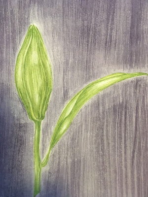
Considering that this illustration was so bad as it was I had a great time playing around with technique and colour. Ignoring the fact that it started as a botanical illustration I touched up the lilies in a looser watercolor style to make them stand out against the background. I am really happy with how well they turned out.
Once the shadow areas had been established I began adding detail and depth. This took awhile and much of the work was done in the evening which has resulted in poor photo quality.
The scratchy background clearly needed further work as well and so I tried out yet another technique I have been meaning to use for ages- bubble wrap. It was delightful.
Feeling that there needed to be a little better colour balance so as not to loose the flowers in the background I mixed a little acrylic and brushed it on.
The effect produced creates the feeling of looking through a grid or fence and is the reason that I have named this illustration- the grass is always greener (...on the other side). I have found in my own gardening experience that no matter how much time I put into my own gardens the flowers just across the bush are always somehow lovelier. This illustration is in essence a representation of my neighbors garden, lovely and lush and seen through a gap.
What I used*:
This is a mixed media piece on paper-size A4
Schminke Aquarelle (flowers and background)
Akademie Acryl paint (grid and bubbles)
Reeves Acrylic paint silver (more bubbles)
*All links are affiliate links. This is not a sponsored post.
To get posts as soon as they are published click on the subscribe button at the top of the page or Follow by clicking on the follow button.


Comments
Post a Comment