Book review: In the mood for colour by Hans Blomquist

In my second apartment as an adult and married woman, I was asked what colour I would like to have the walls painted. A question which might seem normal to many, but to me, someone who had grown up in a series of rented homes where white was the norm, it was a question with an infinite number of possible answers. After soul searching for far longer than was probably necessary I decided to go with the sunflower yellow in the livingroom and 'barn red', to remind me of the US, on one wall of my bedroom. This sounds overwhelmingly colourful in print, but the fact that our apartment was an entirely shady one influenced the choice to add these 'sunny' colours. Although I will probably never be that bold again I did enjoy it immensely and the daily feeling of living with colour has effected how I approach it in my own painting.
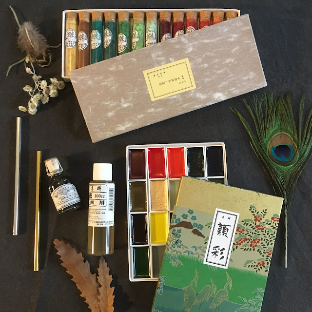
Colour is such an important aspect of painting, and art in general. And one that I have been slowly diving into. My early paintings were less adventurous with colour intensity than my more recent ones. Part of this is the result of the realization that although I love relatively neutral interiors, because of the sense of calm they bring to a home, I love the paintings on my walls to exude life.
With this knowledge of myself, I have begun to experiment more with colour temperature, saturation, and intensity. enhancing the moodiness of bright colours by greying them and adding depth to jewel tones with indigo shadows.
I recently ran across this book on Amazon, which I believe is aimed more at the interior decorating enthusiast, and was enthralled. It plays with tone and contrast and is a feast for the eyes. I bought it after very little hesitation and have been enjoying it immensely. I want to share it with you today as I feel that it is inspirational during those moments when you find your self staring at a blank canvas or bare wall, waiting for a good idea to appear.

This book has several rooms which represent reduced colour palettes. They have small colour swatches on the sides of the first page in each colour section which show the tones side by side.


I also really enjoy the little still life images. They are really nicely set up to show both contrast and pattern. They are useful in evaluating how different backgrounds will work with colour, texture and design.


I think this is going to be a great addition to my art library. I definitely will be opening it up again when planning my next painting. I would really recommend it as a reference.
The book mentioned in this post is:
*Affiliate links- this is not a sponsored post
If you enjoyed this post you might also enjoy other book review posts:
- Studio
-Daily Painting
-Basilicata Terra aqua fuocoe cuore d'Argilla
-Drawing insects
- or browse my Art library
-Basilicata Terra aqua fuocoe cuore d'Argilla
-Drawing insects
- or browse my Art library

Today we enjoyed the first iced coffee of the summer. We took out our cups from Italy to drink it in.
To get
posts as soon as they are published click on the subscribe button at the
top of the page or Follow by clicking on the follow button.


Comments
Post a Comment